Fergus - Engineering Identity
Identity and principles for each of the Design, Development and Product teams.
During the first half of 2018, Fergus underwent an in-house rebrand. In the later half of 2018, we expanded our brand with patterns, imagery, photography etc and along with this I was tasked with giving an identity to our Engineering team. The Fergus Engineering team is split into 3 smaller teams: Development, our programmers and software engineers, Product, our product management team and Design, our small 4-person family.
As part of the project I wanted to give each sub-team their own slice of the Fergus identity and principles that members of each team connected with for their discipline, but we all shared as one Engineering team.
Word association whiteboard sessions with each team.
I wanted to establish core principles for our Engineering team that Dev, Product and Design could all get behind. To do this I ran workshops with each of the 3 teams with some word association activities and some affinity mapping to find out some of the things members of each team associated with themselves and also what their aspirations for their teams were.
From this I wrote statements for each team that summed up their principles and aspirations.
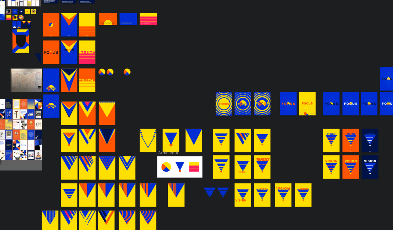
Early concepts of team statements and logos using abstract line-style
I started with the Design teams identity, being part of the Design team I was most familiar with our identity. Early on I wanted to use an abstract line art style to represent the flow and journey of our workflow and also the different streams of knowledge (design thinking, user feedback and research) we gathered to inform our work.
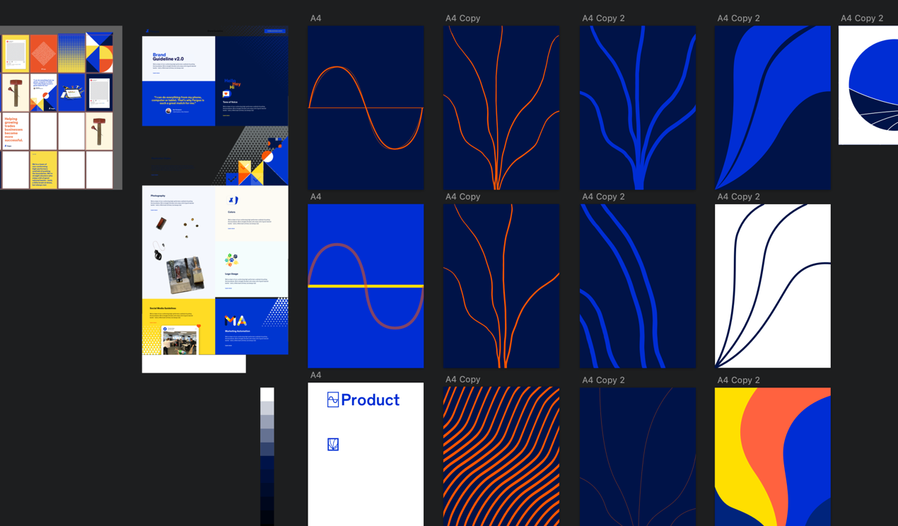
Early concepts of the line art style
Exploration for a more shape based idea
With the line art style I decided it didn’t fit in with the branding style we had for Fergus. I moved more towards a shape based concepts and also using text to emphasis the idea of the shape. I took words from the word association activities that I did with each team that I thought represented each team’s work.
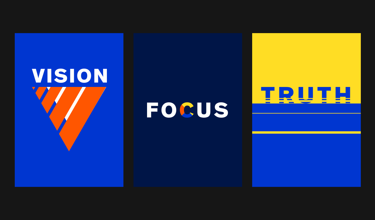
Vision for the Design team
Focus for Development
and Truth for the Product team

“User focused creatives designing a product that understands.”
For the Design team I used a triangle shape to represent having a Vision for the product and being ‘The Voice of the User’. Being visionaries in trades software is a idea we strive for and making sure we represent the best interest of our users is something we always keep in mind.
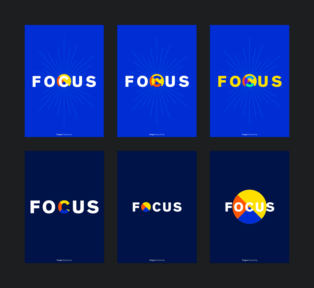
“A focused team, dedicated to building an ambitious, cutting edge product.”
The development team consisted of our software engineers as well as our QA department so a circular shape that felt contained represented focus. I also wanted to portray a bulls-eye and crash test style symbol.
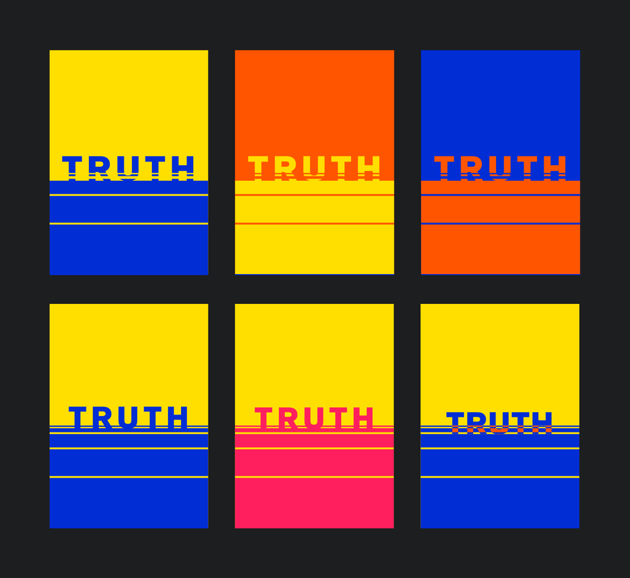
“Goal driven and detail oriented, they empower others and light the way.”
Our Product team determine our products journey, what steps to take next in our journey and embody the truth for the product. For this I used a solid and structured shape to represent grounded-ness and used the line motif to show a perspective of a road or the ‘journey’ ahead.
The Engineering team has had exponential growth in during 2018 and so establishing solid principles and a vision for the product has become increasingly important for all our new additions to work around. Each identity will continue to grow help shape the aspirations of what we want our teams to be.