Fergus UI Refresh
An overhaul of some of the most important parts of Fergus.
In 2018 we brought a fresh coat of paint to Fergus’ main pages. When the design team was established we had the task of dealing with the huge amount of design debt within the software. We had a small 4 person team and so with the UI Refresh we wanted to start introducing a consistent library of styles, components, patterns and layouts without having the massive undertaking of a complete redesign.

One of the aspects we wanted to improve with the UI Refresh project was to improve consistency of styling and information being displayed.
An important aspect in Fergus is the status of various objects and one of the main ways we display status is through labels. At a glance users can determine the status of jobs, quotes, invoices and various other parts of their workflow using labels. There are a huge amount of different statuses in our system and making sure they are clear, concise and communicating the correct information is a great way to improve our users’ workflow.
Above is part of a spreadsheet we used to identify every different label we have in the system, how we use them and what they look like. We discovered a massive amount of design debt in the way our labels were displayed and used. Each status was assigned a new style according to our design system and component library.
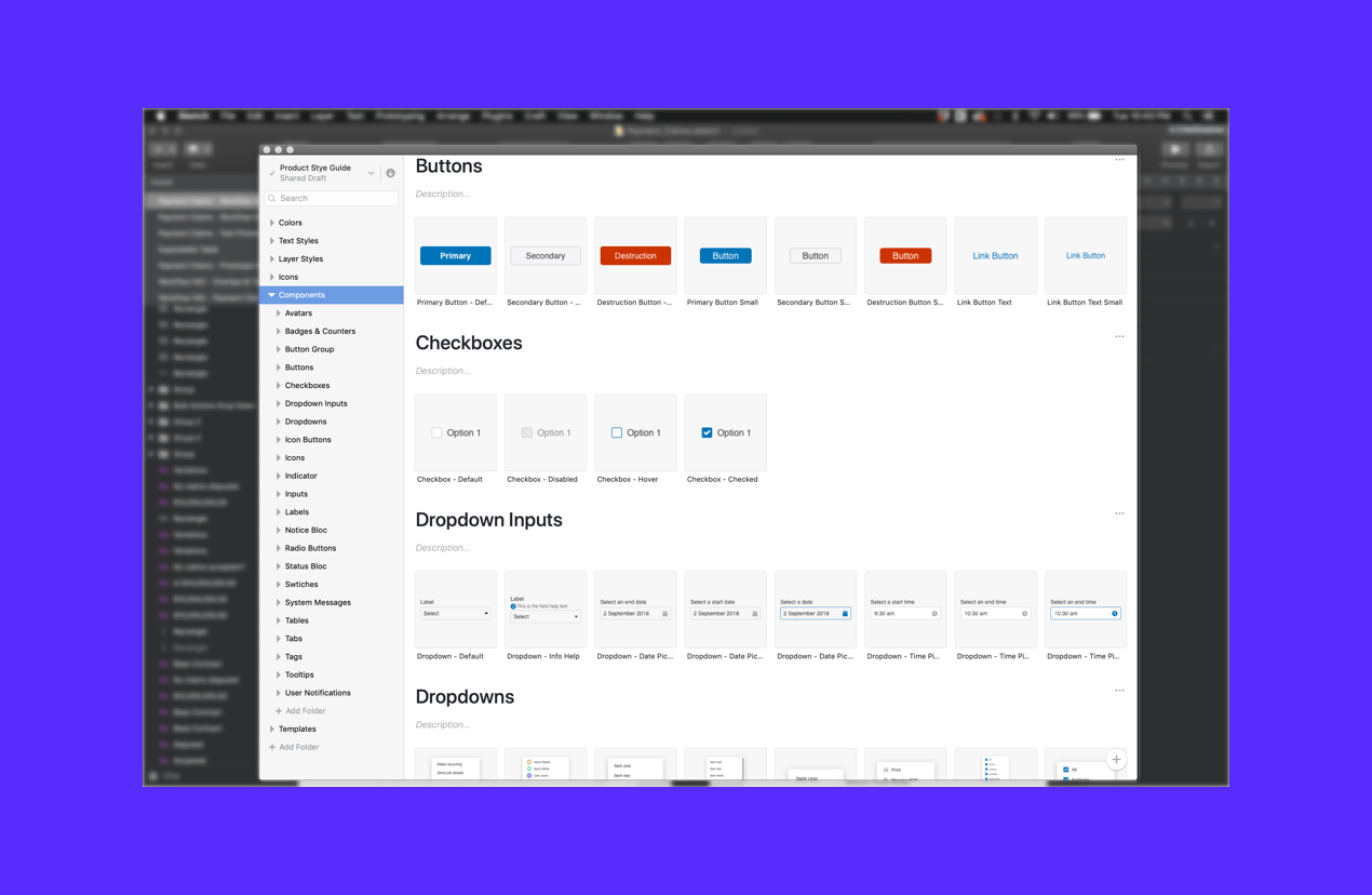
To help with our UI Refresh we began our component library using InVision’s Design System Manager as a base. This allowed us to pull components directly from a shared Sketch library to use in our designs without having to recreate them every single time.

Along with the component library, we also established usage criteria for each component to make sure that designs use the correct components and that components are used in the correct way.
As of this moment we also have further plans to expand our component library into a fully usable site for both designers and developers and also to establish proper design systems within our product team.
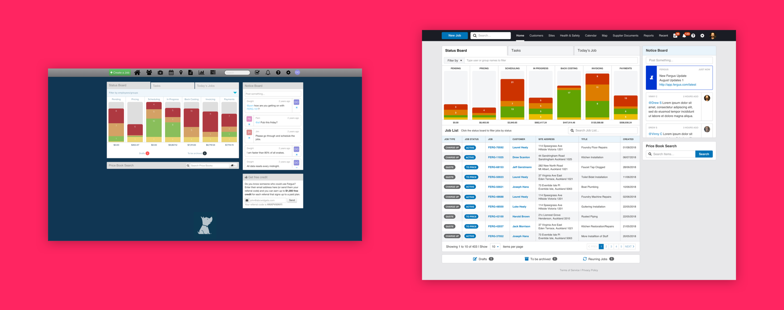
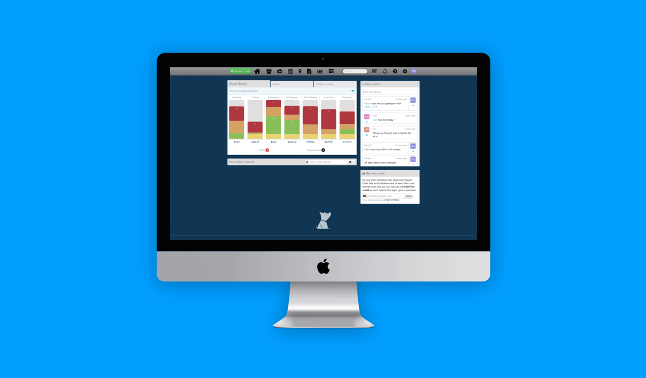
The Fergus Status Board before and after our UI Refresh. The Status Board had gradual improvements over the course of 2018.
The purpose of the Status Board is to see how jobs are tracking. Jobs are placed in each column depending on their status and what needs to be done next.
One of the main problems initially was there was no clear cut way to view just a list of jobs that were within the system and so the Job List was added to the bottom of the Status Board. The list can also be filtered using the columns. A slew of other improvements were made: Colour contrast, readability of text, more consistent styles of components (labels, avatars, icons, inputs, buttons), adjustments to hierarchy of information.
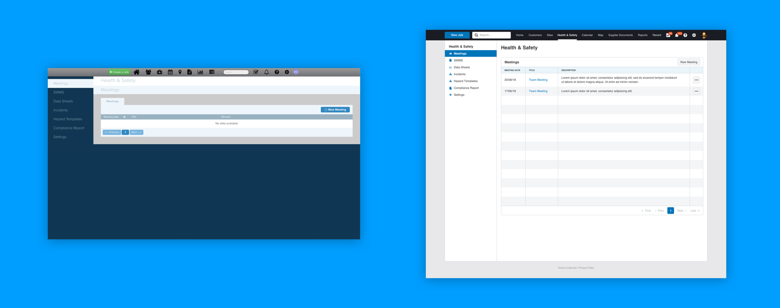
Our Health & Safety interface was the result freelance design input from the months prior to having in-house UX. The general layout and experience of this feature always felt alien to the rest of Fergus.
We wanted to bring it back in-line with the rest of the product to increase its use amongst our user base and to make it feel like it was a part of product instead of a strange . The main improvement made was applying our standard interface pattern to the page, this instantly made it feel like it was part of the product again.
The UI Refresh is one of the first major steps in improving the consistency, usability and general design patterns we use throughout the product. Fergus is a large complex software and dealing with design and technical debt is always an on-going task for our team.